
[Katoen Natie]
ThelogisticsofnavigatingcomplexBU’sonline
- [Client]
- Katoen Natie
- [Year]
- 2017
- [Disciplines]
- UX, Interface Design
- [With]
- Artcore Society
[The brief]
Katoen Natie is a logistics group founded in Antwerp in 1854, active around the world through business units that each serve a different industry. When they went looking for a digital and strategic partner to define and rebuild an online presence that had grown old, I was on the Artcore Society team that carried the project, alongside developers and a second UX/UI designer. Not one website, but a whole digital ecosystem: a corporate site that had to hold very different businesses under one name, and the apps their people used on the ground.
[01]
Everything, basically
Katoen Natie was not very active online yet, and internally a lot ran on separate systems and platforms. The brief was to map all of it, the front end for customers and the back end for employees, and rebuild it. We ended up delivering far more than a website. An app for truck drivers to estimate driving and waiting time at truck cleaning and to check in. A navigation app that guides drivers across the sites to the right terminal. And a long list of smaller tools and pages after that.
[02]
One roof, many houses
The strategic challenge was the shape of the group itself. Katoen Natie is made up of many business units, each with its own way of working, its own offering and its own sector. Yet from day one the brief was clear: everything stays under one Katoen Natie umbrella. So the real question was how much freedom to give each unit to show its own world, inside one brand and one group.
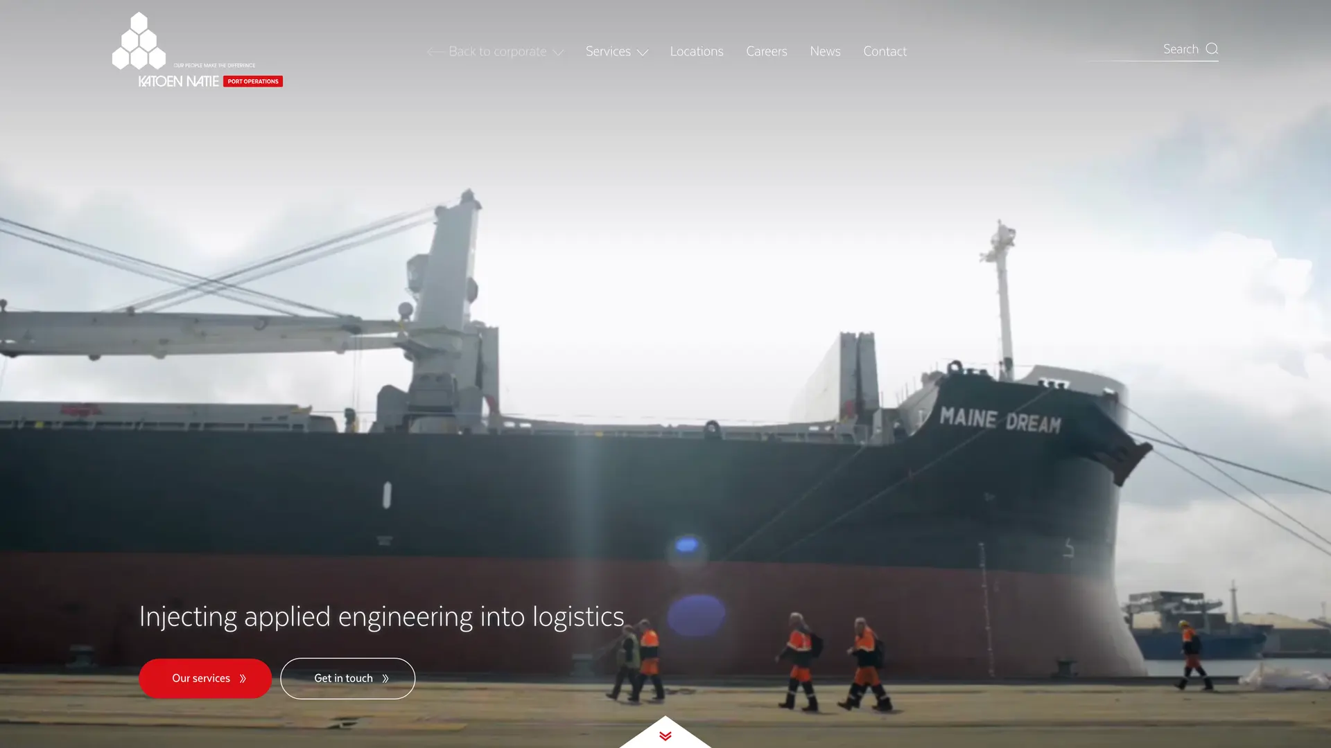
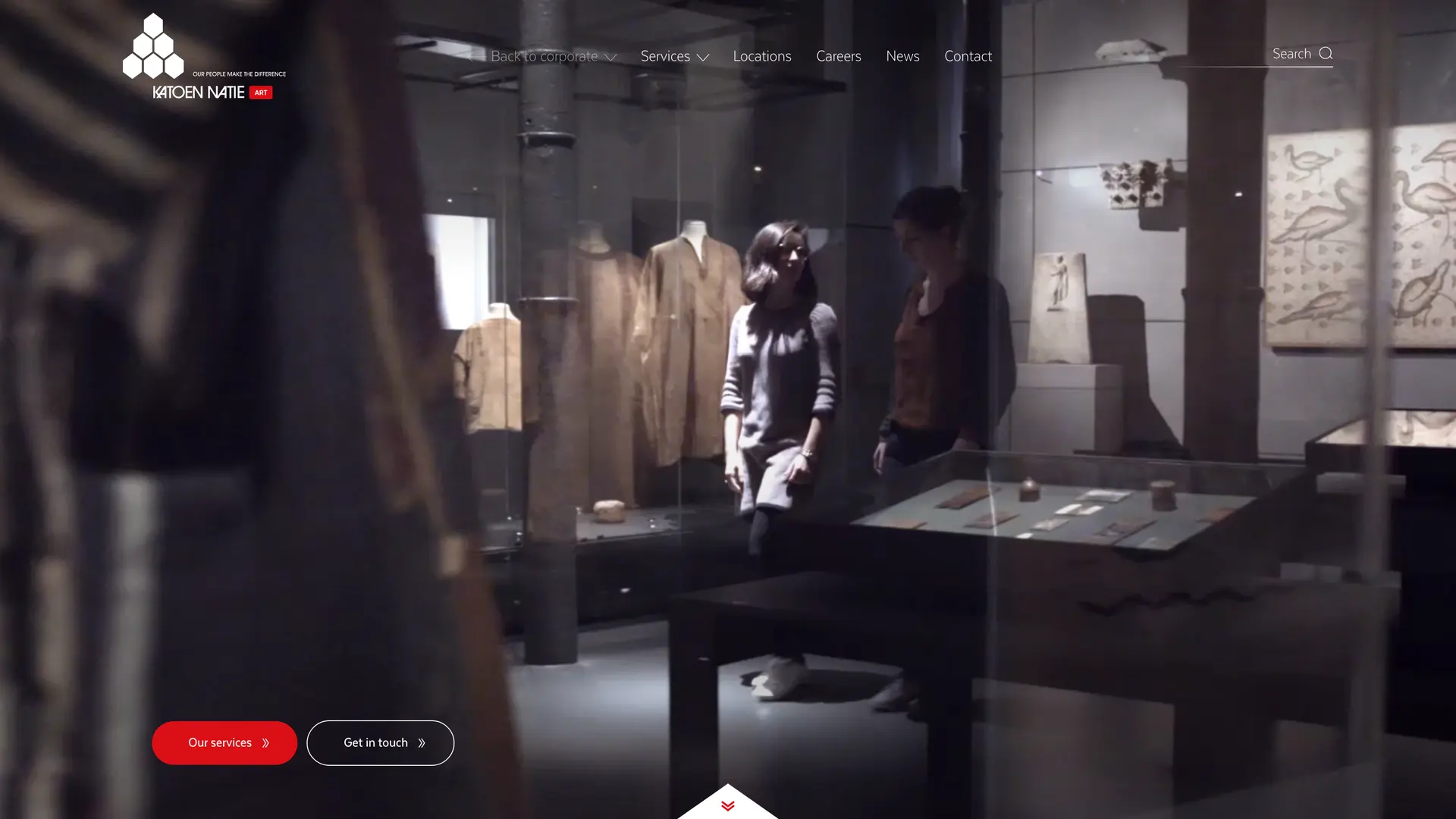
One brand, many worlds, a front door for each.
[03]
A site inside the site
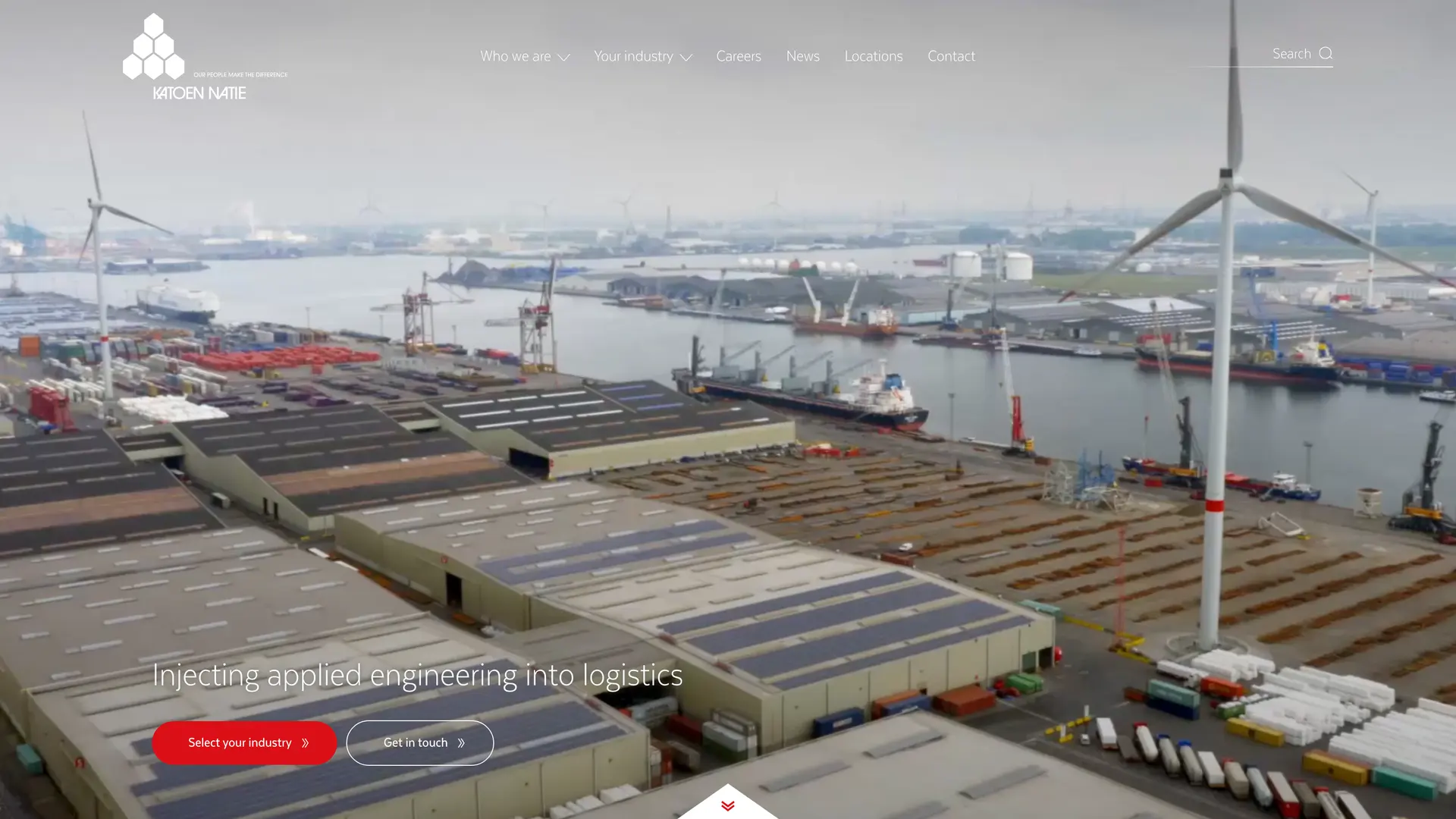
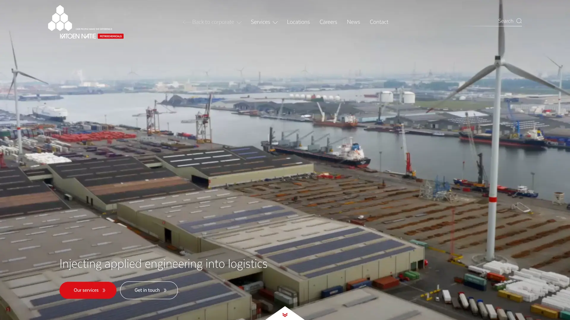
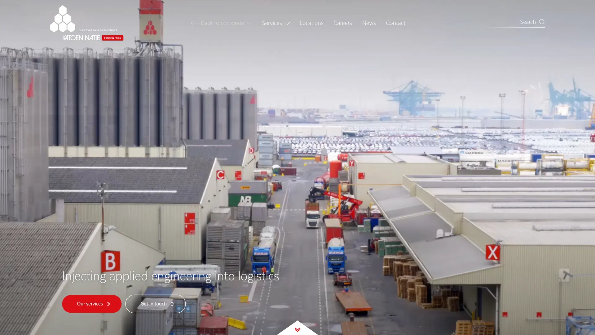
You land on katoennatie.com: who the group is, how big it is, and a short introduction to the business units. Behind that sits a deliberately layered navigation. Today I would call it a site within a site. Step through to a business unit and you arrive on its own address, with content written entirely for that unit, its sector and its customers, while the look and feel keeps you inside the group.
[The group]
katoennatie.com: who they are, the scale, a short introduction to every business unit.
[The unit]
Its own address and its own content, written for its sector, inside the shared look and feel.
[The ground]
Apps for the people on site: check-in and waiting times at truck cleaning, navigation to the right terminal.
[04]
Experts write their own pages
We set up the content structure and wrote a first pass, but the people in the business units are the experts in their own field. So for the largest part we handed them the pen and let each unit fill in its own world.
[05]
Built to last
There are no numbers I can honestly claim. What there is: we stayed Katoen Natie's digital and strategic partner for years, which says what needs saying about whether the thing did its job. For its time it was a modern, good-looking, genuinely handy website. And the apps and applications we delivered were still in daily use years later, some of them the standard to this day. That is the part I am proud of.
Made with the Artcore Society team
This project came to life during my time at Artcore Society and is made in collaboration with the super talented people over there.
Go give them some love
Many brands under one roof?
If your group has grown faster than its website, let's talk about a structure that gives every unit room without losing the whole.
[Next project]
Dumortier